30/10/2016

Exercise 2 Re-contextualising images

I made a pinterest boards where I pined collages by John Heartfield, Peter Kennard, Hannah Höch, Martha Rosler): https://cz.pinterest.com/emilnemecek/collage/

News about migration is everywhere, it is very hot news. The political representation is strictly against to help refugee. Our medias supports the bad image of refugees. Most people are scary because of Muslim religion etc. The refugees are divided on two main block, one where people need a help and the second where refugee are not in danger and they want to exploit situation and get a better life. I do not know how to solve that "problem" but at the top it is always a human being who helps to another human being.

This collage by Peter Kennard from 1974 (title: Apartheid South Africa) is nearly perfect to current situation, especially the sign on the bench: EUROPEANS ONLY

Peter Kennard ‘Apartheid South Africa’, 1974
© Peter Kennard

When I was last month in Köln Germany I made this photograph. It is a refugee camp separated by fence.


Why we need to be saved against another human being? Difference of culture, religion, values? The media only write about problems nothing positive is there. That is why I like Bansky's Steve Jobs streetwork (https://www.theguardian.com/artanddesign/2015/dec/11/banksy-uses-steve-jobs-artwork-to-highlight-refugee-crisis). Steve Jobs was the son of Syrian migrant.

Výsledek obrázku pro Art refugee Steve Jobs

My collage should show somehow the process of selection. Just an idea cross my mind: incubation process, refugee in laboratory glass and Europe is watching.

Here is my collage:


The first image I had was a closed glass and I wanted a picture of refugee in that but there was not good image which fit into the glass. So I used replace photograph by text. The magnifier represents a form of searching - process of separation. I added a caliper because I want to support the absurdity of a measurement who can by European and who not. I removed the caliper after all. The third image is supported by headline "Only suitable" but it did not work. I was thinking and I wanted to support the Europe sign. I used the symbol - flag with stars. I put it into the magnifier, I made the sign only suitable smaller and put it below the glass. I think it looks good and I must make a revision after few days.


29/10/2016

Combining visual elements: Exercise 1


1. Enjoy your stay: written by black-letter looks very old and odd. This combinations is not comfortable to read it, I have strange feeling that something is not right. Someone is watching you :-)

2: DO NOT FEED THE ANIMALS THEY ARE DANGEROUS: the serif font is polite in this example. Sans serif would be right choice here.

3. We are professionals: slab serif does not look too professional, it does take my trust to that sign. The font does not represent seriousness.

4. Luxury: this hand (script) font makes the sign somehow sportive. I can image that font suitable for toy shop.

5. hand made: the font is too hard, it can be used for tools not for food or toys where human fineness is expected. I would like to see serif font for that case.


Some vernacular typography examples (from Design course): http://kafkasfriend-log.blogspot.cz/2011/05/vernacular-typography.html

19/10/2016

Exercise 1 Identifying visual communications

1 Persuasion


Print example: Heinz hit my eye, I love Heinz Ketchup and it is interesting to see advertisement from 1960s and today one. There are tons of advertisements which are appealing our awareness. I like the McLuhan note that advertisement is a kind of grievance: you are not buying my product.


Fear
Výsledek obrázku pro syphilis advertisementVýsledek obrázku pro syphilis advertisement

Health:
This is an advertisement which we can judge as a lie today. I do not believe that producers of cigarette can believe in that, but I notice that there are movie series where man is smoking, drinking and taking drugs, it is displayed as a normal state, what is more that the addicted can be clean in a minute! (Mr. Robot, True Detective)

http://tobacco.stanford.edu/tobacco_main/images_body.php?token1=fm_img2785.php

Moving picture:
How you can take an awareness by creepy add:
https://www.youtube.com/watch?v=rx4jEIZyTZU

When searching moving adds it let me to the TOP 10 creepy ... : https://www.youtube.com/watch?v=5qNhkw_Ah4U and I ended at this project: http://www.methproject.org/
this is also great to see to understand the project: https://www.youtube.com/watch?v=uGiAxwgrF_k


2 Information: 

Recently I have read a book about a brain (Mind future by Michio Kaku), so this information is nice example what our brain does:
Data Visualization

I love this information about METH addiction, you get the informartion as you search on the page, the information is extended by sound: http://www.methproject.org/answers/what-is-meth-induced-psychosis.html#Psychotic-Behavior

https://blog.slideshare.net/2014/11/10/the-power-of-visuals-10-facts-you-need-to-know

Leonardo da Vinci:
Exploded view drawing of a mechanical system by Leonardo da Vinci:


3 Identity design

Fedex is a brand around a guaranty of next day delivery time. I can not overlook that brand on roads, packages in news.
Výsledek obrázku pro Fedex advertisement Europe

Amazon is a place where I can bought rare things such as books which are not able to buy in my country for example. I choose this part of India newspaper because I do not see amazon advertisement in my country at all. Is not that a grievance of Amazon hey India you do not buy things/goods via my www portal :-) I like the smiling Amazon logo ir is easily recognisable.


4 Authorial content

Great example of Alice in the wonderland illustration. I love the atmosphere in Benjamin Lacombe's illustrations. The innocence is great feel in these pieces.

Benjamin Lacombe sublime la beauté étrange d'Alice au pays des merveilles - Sortir - Télérama.fr: ALICE IN WONDERLAND BY BENJAMIN LACOMBE: ALICE IN WONDERLAND BY BENJAMIN LACOMBE: Benjamin Lacombe ILLUSTRATION | Alice in Wonderland:

Moving graphic:
I really admire what Sander van Dijk does with After Effects. his experience are great and his work is recognisable amongst motion graphic community: https://vimeo.com/18043595 


Reflection on reading

16/10/2016

Commercial art

...... usually magazines illustrations or posters designed to advertise goods, services or forms of entertainment. The usage of the term declined in the early 1960s, in favour of the more general 'graphic art'.

.... after World War I, the poster represented the mail format for patrons, artists and their audience in the commercial field. The establishment of poster sites, with standardised frames for each picture poster encouraged acceptance of the new public art.

The poster format encouraged a total integration of image with letters ...... the pictorial was some extent superseded by the functional graphic style derived from Constructivism and Bauhaus. This involved a conceptual rather than an illustrative approach ..............

Mass production and indispensability, the key characteristic of commercial art ....

JULES CHÉRET is considered one of the founders of picture poster, his work inspiring, among others, Henri de Toulose-Lautrec, Ludwig Hohlwein (1874-1919)

Cheret MoulinRouge ParisCancan - Jules Chéret - Wikipedia, the free encyclopedia: this poster by Toulouse-Lautrec has intrigued me since I was an art student in high school: Ludwig Hohlwein. German. Plakatstil. Poster for Men's Ready-made clothing. 1908. Powerful shapes.:

1922 individual posters designed by more progressive artist such as E. Mcknight Kauffer ....
E. McKnight Kauffer, "Come on the Telephone," 1934. Lithograph. Courtesy Museum of Modern Art.: Výsledek obrázku pro E McKnight Kauffer

The elements of biography and artistic creativity dominated, and the perspectives of the audience and the mass-produced image were less articulated.

Despite the growing impact of photography in the imagery and in printing, the individual art work remained in focus.This profile was encouraged not only by the illustrative styles of such poster artist as Frank Newbound 

Use The Fastest Mail | Frank Newbould, 1933. | Paul Malon | Flickr: Kingston ~ Frank Newbould:

but also by the organisation of exhibitions of work by such other leading figures as Ashley Havinden (1903-73):

Ashley Havinden y su evolución al diseño moderno.: Ashley Havinden illustration for Wolsey Socks.:

and McKnight Kauffer above.

20s 30s Art Deco - Style moderne

The two-dimensional style was decorative rather than rationalist, however, and although it was derived in part from Bauhaus ideas, its universality was based on its universality was based on its application across national boundaries to reach new markets, rather than on any concept of a new social order. Cassandre's work was antithesis of the functional graphic art that was developing contemporaneously.

Adolphe Mouron Cassandre, poster for Cycles Brillant, 1925. France.: French modernist poster by Cassandre. A pearl!:

Functional graphic and other developments

Lissitzky's photomtage
El Lissitzky  www.artexperiencenyc.com:

Photomontage was the process that encapsulated the anti-figurative manifesto here, its adoption by commercial artists, especially by the partnerships of artists and photographers, as the rhetorical device by which consumer's imagination could be seized, produced a kind of commercial propaganda in 1930.

The new style was cautiously welcomed in Britain, and such graphic artists and photographers as Herbert Bayer, who studied and taught at the Bauhaus .....
Herbert-Bayer-couverture-livre-visual-communication-architecture-painting: 1953 Illustration Poster HERBERT BAYER Olivetti Typewriter by maribel:

The conceptual approach to communication gradually supplanted the literal or narrative genre, and this is evident to some extent in work by such graphic artist as Tom Eckersley (1914-97).
10 | The Masterful, Eye-Popping Posters Of Tom Eckersley | Co.Design | business + design: Eek! Tom Eckersley, Health and safety poster, 1990.:

Like constructivism, decorative Surrealism proved an effective means of promoting products and ideas.

American Surrealist MAN RAY
Man Ray  Art Experience NYC  www.artexperiencenyc.com/social_login/?utm_source=pinterest_medium=pins_content=pinterest_pins_campaign=pinterest_initial: Man Ray, Indestructible Objet:

Bauhaus and Constructivist influences, including the combination of typography and photography, continued to appear after World War II, in particular in Switzerland. The development of Swiss graphic design included typographic innovations ("Swiss graphics") and commercial posters by such as JOSEF MÜLLER-BROCKMAN.

Josef Muller Brockmann: Josef Müller-Brockmann - 1959:


Inventive use of typography continued into the 1960s, including negative transformations using dot-matrix patterns as well as such typographic collages as BRUNO MUNARI

Design as Art by Bruno Munari, Penguin Books, Baltimore,  1971:  ernests:

During this period commercial art inspired POP ART, which in turn influenced such posters as ROBERT ABELs 7 UP.

Robert Abel, Charles White III 7UP 1975 Medium Offset lithograph Dimensions 45 1/2 x 59 1/2" (115 x 151 cm) Credit Gift of Leslie J. Schreyer  Robert Abel, Charles White III. 7UP. 1975:

Highly sophisticated photography also played a vital role internationally in commercial posters in the later 20th century e.g. Masatoschi Toda's Parco: A woman's Skin Absorbs Dreams, 1983).

Masatoshi Toda Parco, A Woman's Skin Absorbs Dream 1983:

The photography often employed such techniques as photo-montage for commercial ends far removed from those for which they were originally intended.


09/10/2016

McLuhan, (Herbert) Marshall

Previously I wrote that:

"I think that any medium produces a message by its content which is interpreted in mind of a "receiver" who has its own culture, social, education associations.".

Now, McLuhan's message especially in case of  TV medium is that the medium has vast influence on people. Nevertheless the content is "incidental" and the awareness is subjective. The picture of world seeing through TV screen is limited to the content. Seeing news established on ratings (sales) everyday we can see the world as bad place to live. Internet is a place where we have freedom to choice what we want to see but still there are business involved to set a trap for your attention. What is true? The TV has vast power to manipulate masses and we see it for example in Russia where the medium is used against to the west culture.


Some notes:
At centre of his work is the idea that the content or message of mass media communications is much less important than their form or medium, though he did not consider these to be mutually exclusive.

The medium is a message part 1
The medium is a message part 2
The medium is a message part 3

Notes @ Manu Forster
Part 1
4:34 "... to read means to guess... a reader is making decisions very rapidly..."
6:01 "Any painter, any poet, any musician sets a trap for your attention... That is the nature of #art..." 7:35 "... TV:.. The effect of that huge service environment -- on You personally -- is vast. The effect of the program is incidental." 7:59 -- 8:37 "... The alternative to violence is dialogue..." 12:14 "Cricket is a very organised form of violence... controlled forms of violence in a community...""

Part 2
1:17 #Nostalgia "... When people have been stripped of their private identities they develop huge nostalgia!" 2:14 "... costumes..." 3:14 "... a manifestation of grievance..." 3:42 "... Professor!.." 4:28 "... One of the peculiarities of electric speed is that it pushes all the unconscious factors up into consciousness..." 5:15 "What is desperately needed is some kind of understanding of the media which would permit us to program the whole environment... So that [...] literate values would not be wiped out by new #media... If You understand the nature of these new forms You can neutralize some of their adverse effects and foster some of their [beneficial] effects... " 6:14 "... Big Screens... awareness of process... " 7:37 "... participation in replay... pattern recognition... extreme self-awareness... awareness of the nature of the operation." 8:45 "... the future of education requires that we pay much attention to the media we're employing... as forms of study... awareness of the nature of the operation..." 9:17 "... television uses the eye as an ear..." --> 9:57 "... television is [...] a resonating form of experience..." 10:07 ... 10:11 "Is television the ultimate medium?.. Or is there worse to come?.." 10:19 "... You've heard of the #hologram?" ;)

Part3
4:14 Advertisement grievance: you are not buying my products :-)
Media effect on politics: parties and policies become very unimportatnt and the image of politician takes tremendous new importance this is television at least..... Radio politics are completely different form completely different message TV politics do not permit very much interest in the policy or the party but the individual candidate must have charisma = looking like a lot of other people ......

Design by Penny Sparke - notions

Early designers = draughtsmen, engineers = related to specific product areas = conceive a product, to define its function function, materials, means of assembly, cost etc. and to communicate these to the people in manufacture process. In the early consumer goods industries - ceramics, textiles, furniture - copying rather than the creation of new models and forms was often the norm. Design was much about adapting pattern book decorations to the surfaces in order to render them stylish and fashionable.

19th century.

In the early 19th century, design continued to be associated with surface decoration and the use of historical styles. In Britain students were train to draw, so they could apply their talents in the context of manufacture. At this time design was seen as the answer to Britain's need to compete with France in the area of trade by raising the aesthetic level of British goods. The Great exhibition was a testimony to to the progress made by British industry over the previous century and a mark of the importance of style and decoration in the goods it produced. It was turning point for British design, as it stimulated the development of the design reform movement. John Ruskin. William Morris, and the latter followers of what came to be called the ARTS AND CRAFTS MOVEMENT saw what they considered the stylistic excesses of the Great Exhibition as a symptom of the overt materialism and conspicuous consumption of Victorian society.

20th century.

The ideas and ideals of the Arts and Movement had profound effect on 20th-century European design: the apparent democratisation of design seemed to express the spirit of the new century. Designers and craftsmen collaborated to produce goods that, in the early years, were characterised by simplicity and geometrical austerity. European designers were looking for new ways of expression that were appropriate to life in the 20th century, the trend was towards a new functional purism (FUNCTIONALISM) and away from the self-representation and display associated with the previous century. While in Europe the emphasis was primarily on the mass manufacture of the products of traditional decorative art industries, in the USA it was on goods that had more technological bias: guns, sewing machines, bicycles, etc. By the turn of the century the American system of mass production had been perfected. Ford's T Model (1913) was the symbol of the standardised product.

The rigorous methods embraced by Ford led to a crisis in the 1920s because his idea of continuous, standardised manufacture failed to take into account the psychological needs of the consumers who, in more prosperous times, wanted novelty and style. Awareness of the consumer's psychological relationship with product, enhanced by advertising, was crucial to the role of design in manufacture in the 20th century: that of ensuring that goods meet not only the demands of mass manufacture but, perhaps even more importantly, those of mass consumption.

While the Americans were involved  with the programme of industrial design and mass production, designers in Europe during the inter-war years continued to be more interested in the metaphorical and aesthetic implications of contemporary life and in evolving objects that were appropriate to it.

Designers in such countries as Germany, the Netherlands, France, Austria, Russia and elsewhere had, by the end of World War I, all developed an avart-garde approach set within a framework of fine art and architectural modern ideals.

The BAUHAUS set out encourage young designers to create form out of abstract principles that were in tune with the modern age technology and mass production. The BAUHAUS set a tone that dominated the philosophy of design until 1960s. During 1930s many of the MODERN MOVEMENT protagonists left Europe when the Bauhaus was forced to close by the Nazi authorities. They eventually settled in the USAm where they disseminated Bauhaus design.

The greater spread of mass consumption, however, meant that the clash between pragmatism and idealism in design reached its peak in the 1960s.  POST-MODERNISM succeeded MODERNISM as a dominant cultural force, and design, along with other cultural forms, entered a period of self-criticism and revision.

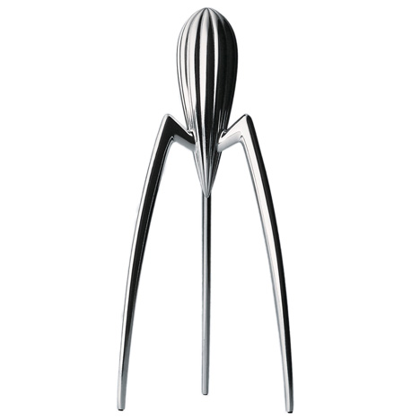
The shifts in the aesthetic and meaning of design in the 1960s were sign of the high level of penetration by design into society and culture as a whole. By the 1980s design had become part of daily life, discussed in mass publication magazines and exhibition spaces. Design had also become part of popular language: such phenomena as 'designers' jeans, 'designer' vacuum cleaners and even 'designer' lemon squeezers acknowledged that the most potent meaning of the word was that of 'added value' in the form of style - an indefinable quality that made things not only useful but also more desirable, albeit in a somewhat intangible way. 

Idealism and pragmatism had finally come together in a synthetic definition that had mass appeal.